


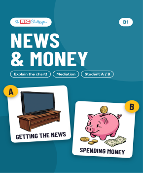
Explain the chart! Getting the news and spending money
Academy Access
It's Time to Play!
Learning while having fun is the best method! Launch this interactive game for a fun and motivating review session.
Premium Resource. This tool is part of The Big Challenge Academy. Subscribe for unlimited access to hundreds of premium resources.
Pedagogical Guide
Objective & content
A mediation pair activity with charts in per cent, in two rounds. In round 1, Student A has a bar chart from the "Teen Life Survey 2026", "Where do you get most of your news?" (1,000 teens aged 13-17: social media, TV, family and friends, news sites, newspapers), with a note of the 2020 figures. Student B, who is writing a report on teens and the news for a media class, draws the bars on an empty chart and answers questions. In round 2, Student B has a bar chart, "What do you spend most of your money on?", with the 2020 figures, and Student A, who is helping to prepare a "Smart with money" week at school, draws it and answers. The pupil with the chart must not show it: they say the numbers, the changes since 2020 and what they mean. By the end, pupils can explain a trend, not only a number: over half, about a quarter, it has gone up / down from ... to ..., the biggest change since 2020 is ..., and give a reason: That's probably because ....
Pedagogical guide
Mediation means passing on information to someone who hasn't seen it. At B1 the information is a trend: the figures for 2026 and for 2020, and the change between them. The check is built in: if the partner's bars match the chart, the explanation was clear; if not, the pair finds where it went wrong. Each page has the rule ("Don't show your chart. Explain the numbers and the changes."), a box of phrases (Over half / about a quarter of teens ..., It has gone up / down from ... to ..., The biggest change since 2020 is ..., That's probably because ...) and questions to help the pupil who asks. The language is per cent, the present perfect (It has gone up), comparatives and superlatives, and wh-questions. Worth saying in class: "points" is the word for the difference between two percentages (from 32% to 20% is 12 points). The survey is invented, and each question has one answer. Page 3 is the teacher page: the idea, four steps, the language and the key.
Suggested procedure
One activity of about 25 minutes.
- (3 min) Set up the pairs: copy page 1 (Student A) for half the class and page 2 (Student B) for the other half, and put pupils in A + B pairs, face to face. Nobody shows their chart. Read the rule and the phrases box with the class, and explain "points".
- (8 min) Round 1: A explains the news chart and the 2020 figures; B draws the bars and answers the questions.
- (8 min) Round 2: B explains the money chart and the 2020 figures; A draws the bars and answers.
- (6 min) Pairs put the charts side by side and check, then discuss: "Why has ... gone up / down?". Check with the key on page 3.
Adaptations
[S] The pupil who explains gives the 2026 numbers first, then the 2020 note in a second turn.
[A] The class does the same survey and writes a short report comparing their results with the Teen Life Survey.
Materials & prerequisites
Print infogap.pdf: page 1 for Student A and page 2 for Student B, one copy per pupil; page 3 is the teacher page. Pupils need a pencil, and a ruler helps. They should already know per cent, the present perfect and comparatives. It goes well with work on the media, social media or money, and with the "Explain the chart!" sheets at A2 and the "Explain it to me!" sheets.